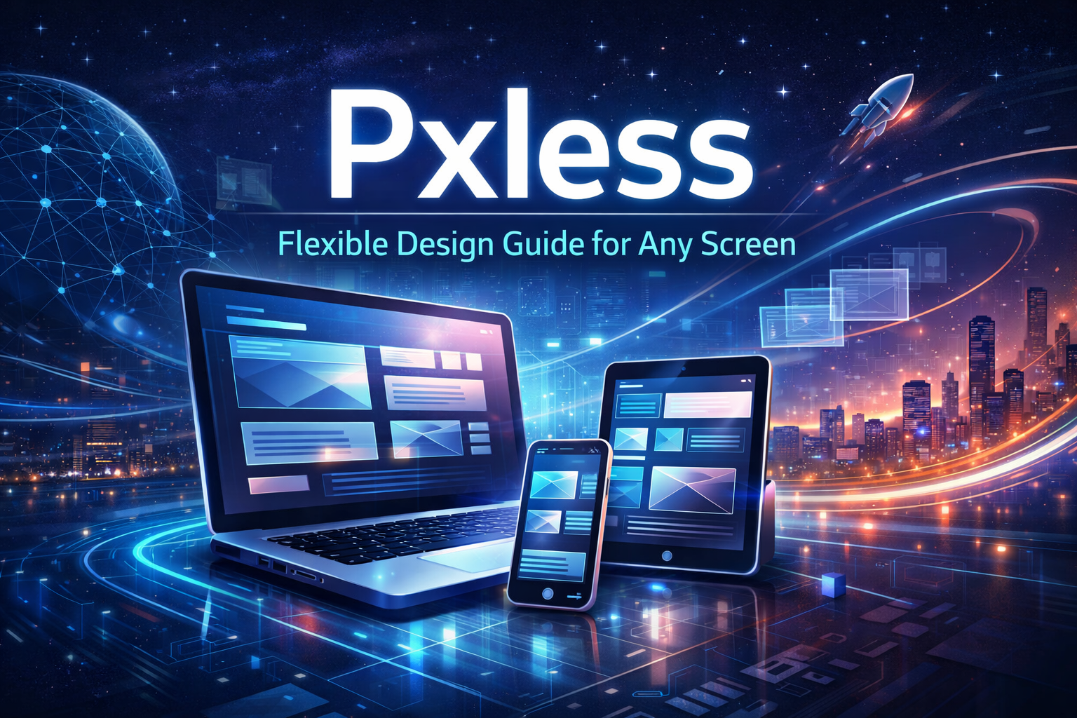
Pxless changes how people create websites and apps. It moves away from setting every element to exact pixel sizes. Instead, it focuses on designs that adjust smoothly to different screens and user needs. This guide explains everything about pxless in clear steps. You will learn the basics, the reasons it works well, and ways to apply it in your own projects. By the end, you will have practical ideas to make your digital work more reliable and user-friendly. Many designers and developers now use pxless ideas to cut down on fixes and build stronger products.
This approach started as a response to common issues in web work. Screens come in many sizes today, from phones to large monitors. Fixed pixels often break layouts on new devices. Pxless fixes that by letting content shape the space. It uses rules based on proportions rather than numbers. The result feels natural to users and saves time for teams. This post covers all major parts so you can start right away without gaps in your knowledge.
What Does Pxless Mean in Simple Terms
Pxless stands for a way of thinking in design and coding. It means you stop depending on fixed pixel numbers for widths, heights, or spacing. You choose units that change with the context instead. For example, you might use percentages or relative sizes that grow or shrink based on the screen. The goal stays the same: create interfaces that look good and work well everywhere.
In practice, pxless asks different questions during the design phase. Rather than deciding a button must measure exactly 48 pixels tall, you think about how it relates to nearby text or images. This shift helps layouts flow better. Screens still use pixels under the hood, but your decisions do not lock to them. The focus turns to behavior and feel across devices.
Pxless grew popular as more people accessed sites on tablets, watches, and foldable phones. Old methods that worked on desktop computers started to fail. Teams noticed they spent hours tweaking code for each new screen size. With pxless, those tweaks drop sharply. The system handles changes on its own through smart rules.
Many people mix up pxless with other trends like responsive design. It builds on that idea but goes further. Responsive design often still uses some fixed pixels with media queries. Pxless tries to remove as many fixed values as possible. It relies on fluid grids, flexible typography, and content that sets its own space.
Why Traditional Pixel-Based Methods Cause Problems
Fixed pixel designs worked fine when everyone used the same monitors. Today, that approach creates headaches. A layout set to 1200 pixels wide looks great on a laptop but forces horizontal scrolling on a phone. Users get frustrated and leave the site.
Maintenance becomes a big issue too. Every time a new device hits the market, you rewrite parts of the code. This takes time and money. Small changes, like a user increasing font size for better reading, can break the entire page. Accessibility suffers because the design fights against user preferences.
Teams waste effort arguing over exact pixel values in meetings. Designers create perfect mockups in tools that show one screen size. Developers then struggle to match those in real code. The final product often looks different from the plan. Pxless cuts these fights by agreeing on rules upfront instead of numbers.
Performance can drop as well. Fixed layouts sometimes require extra images or scripts to handle different views. Pxless keeps things lighter because elements resize naturally. Pages load faster and use less battery on mobile devices.
Key Principles That Make Pxless Work
Content leads the layout in pxless thinking. You let text and images decide how much space they need rather than forcing containers around them. This creates breathing room that feels right on any screen. For instance, a paragraph might expand based on its word count instead of a set width.
Relative sizing replaces fixed pixels. You use units like em, rem, percentages, or viewport widths. A heading might sit at 2.5 times the base font size. This way, everything scales together when users change settings. The design stays balanced without manual fixes.
You build systems instead of single screens. Think in tokens and scales for spacing, colors, and sizes. A spacing scale might use multiples of a base value like 1.5 rem. Components follow these rules and adapt automatically. This system thinking makes large projects easier to manage over time.
Consistency comes from ratios and logic. You set clear relationships between elements. A button might always sit 1.5 times the line height away from text. These rules keep harmony even as the layout changes. The result looks professional without looking rigid.
Main Benefits You Gain from Pxless Design
Your designs reach more users without extra work. Because layouts adjust to screen sizes and user settings, people with different devices or vision needs have a good experience. This improves satisfaction and keeps visitors longer on your pages.
Development time drops after the initial setup. Once rules are in place, adding new pages or features happens faster. You avoid the cycle of testing and fixing for every breakpoint. Teams report fewer bugs in the long run.
Collaboration improves between designers and developers. Everyone works from the same set of rules instead of debating pixel values. Decisions focus on user needs and content flow. Projects move quicker with less back-and-forth.
Future updates become simpler. New screen shapes or technologies fit into the existing system. You do not redesign the whole site when a new phone model launches. This saves money and keeps your work current for years.
Accessibility scores rise naturally. Relative units respect browser zoom and font scaling. Screen readers and other tools work better because the structure stays logical. Many pxless projects meet strict guidelines without added effort.
Step-by-Step Guide to Start Using Pxless
Begin by reviewing your current project. Look for every place you used fixed pixel values in CSS or design files. Make a list of widths, heights, paddings, and margins. This shows where changes are needed.
Next, set a base font size and scaling rules. Choose rem units tied to the root element. Define a spacing scale with values like 0.5rem, 1rem, 1.5rem, and so on. Apply these across your stylesheets so everything stays connected.
Switch to flexible containers. Use CSS grid or flexbox with fractional units or percentages. For example, set a main content area to 70% width and let sidebars take the rest. Add min and max widths to prevent extremes on very large or small screens.
Test early and often on real devices. Open your work in a browser and resize the window. Check on actual phones and tablets too. Note what feels off and adjust the rules, not individual elements.
Document your system in a shared guide. List all spacing tokens, typography scales, and layout patterns. New team members can follow it without guessing. This keeps the project consistent as it grows.
Start small if the change feels big. Pick one section like a navigation bar or card component. Convert it to pxless rules and see the results. Once it works well, expand to the full site.
Common Challenges and Easy Fixes
Some designers feel they lose control at first. They miss the exact placement pixels gave them. The fix is to trust the system and focus on relationships. Over time, you gain better control because the whole design stays balanced.
Layouts can look messy without strong rules. To avoid this, stick to your spacing scale and test with real content. Add comments in code to remind yourself of the logic behind each choice.
Team members may resist the shift. Hold a short workshop showing before-and-after examples. Let them try a small task with pxless rules. Results usually convince them quickly.
Performance worries pop up sometimes. Relative units do not slow things down if you keep your CSS clean. Use modern techniques like container queries for even finer control when needed.
Real Examples of Pxless in Action
News websites use pxless ideas for article pages. Text flows naturally across devices while images scale to fit. Readers can adjust font size without breaking columns. Maintenance costs stay low even with daily updates.
SaaS dashboards benefit a lot. Complex data tables and charts resize cleanly. Users on laptops or phones see the same information clearly. Teams add new features without redesigning the whole interface.
E-commerce stores apply pxless for product grids. Items rearrange based on screen width without empty gaps or overflows. Shopping feels smooth, which helps sales.
Corporate sites with long pages use it for better readability. Sections stack or expand based on content length. The design stays clean on every view.
Tools That Support Pxless Work
Modern CSS features make pxless easier. Container queries let elements respond to their parent size instead of the full viewport. This adds precision without fixed pixels.
Design tools like Figma now support variable modes and auto layout. You can set constraints that mimic pxless behavior during the mockup stage.
Code editors with good linting help catch old pixel values. Extensions flag fixed units and suggest relative replacements.
Browser developer tools show how layouts behave at different sizes. Use them to simulate real user conditions.
Version control systems track changes to your design tokens. This keeps the team aligned on rule updates.
How Pxless Fits into Team Workflows
Design handoff becomes smoother. Share a token file with spacing and size values. Developers implement once and the system handles the rest.
Project timelines shorten after the learning phase. Fewer revisions mean faster launches. Clients see working prototypes earlier.
Feedback loops improve. Stakeholders review on their own devices and notice the adaptability right away. Comments focus on content instead of layout tweaks.
Training new hires takes less time with clear documentation. Everyone learns the same rules from day one.
Measuring Success After Switching to Pxless
Track load times and bounce rates before and after. Faster pages and happier users show up in the numbers.
Check maintenance tickets. A drop in layout-related bugs proves the system works.
Ask users for feedback on different devices. Higher satisfaction scores confirm the change helps.
Monitor development speed. New features should take fewer hours once rules are set.
Review accessibility reports. Better scores often follow without extra audits.
Common Questions About Pxless
People wonder if pxless means no pixels at all. The answer is no. Screens still render in pixels. You just stop basing decisions on fixed numbers.
Others ask if it works only for websites. It applies to mobile apps, desktop software, and even emerging interfaces like augmented reality.
Some worry it makes designs less precise. In reality, it creates stronger harmony through logic and proportions.
Teams ask about the learning time. Most people feel comfortable after one or two small projects.
Tips to Keep Improving Your Pxless Skills
Practice on personal projects first. Build a simple blog or portfolio with full pxless rules. Experiment without pressure.
Join online communities where designers share fluid layout examples. See how others solve similar problems.
Read the latest CSS specifications. New features often support pxless ideas even better.
Review your work every few months. Update rules as your content or audience changes.
Teach one tip to a colleague each week. Explaining concepts strengthens your own understanding.
Why Pxless Matters More Now Than Ever
Devices keep changing shape and resolution. Fixed designs cannot keep up without constant updates. Pxless prepares you for whatever comes next.
Users expect seamless experiences everywhere. They switch between phone and laptop without thinking. Your designs should match that flow.
Businesses save money with scalable systems. Less redesign means more budget for new features or marketing.
The web grows more personal. People adjust settings for comfort. Pxless respects those choices and keeps the interface usable.
Final Thoughts on Building with Pxless
Pxless gives you a practical path to better digital products. It removes the stress of pixel chasing and lets you focus on what matters: clear content and smooth interactions. Start with small changes today. Follow the rules, test often, and watch your layouts improve across every screen. Your users will notice the difference even if they cannot name it. Over time, your projects will feel more alive and require less upkeep. This guide covers the full picture so you can move forward with confidence. Apply these ideas step by step and see stronger results in your next build.